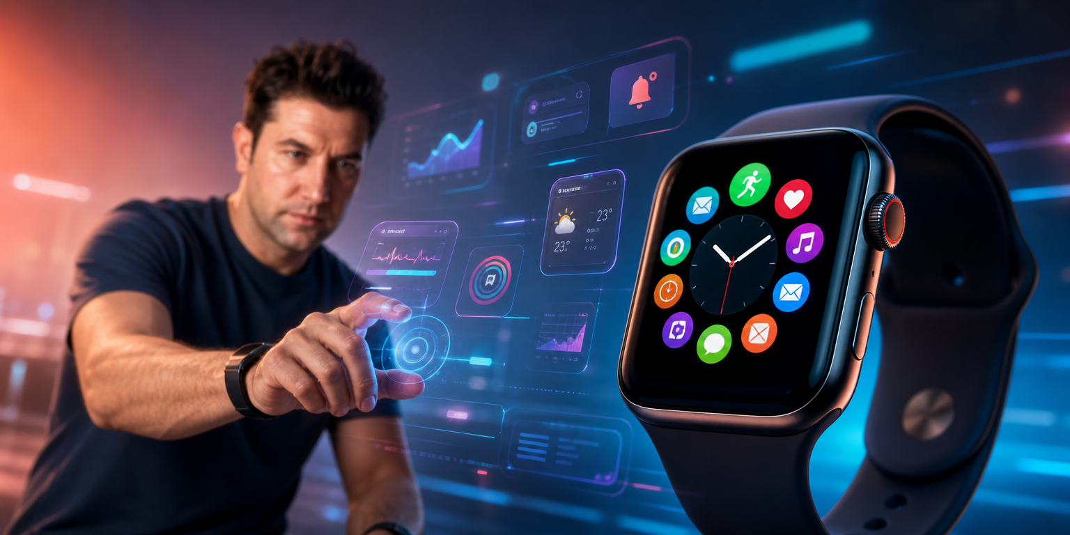
UX Design for Wearable Technology and Smartwatches: Big Experiences on Small Screens
UX Design for Wearable Technology and Smartwatches: Big Experiences on Small Screens
While smartphones remain central to our lives, smartwatches and wearable technologies are no longer just notification screens. From health tracking to contactless payments, from quick message responses to navigation, we now manage many critical tasks from our wrists.
However, there is a world of difference between designing a mobile application or website and designing a smartwatch screen that is only a few centimeters in size.
In wearable technologies, reducing cognitive load and providing a smooth experience is literally a “micro-surgery” job for designers.
So, how do you build a “big and fluid” user experience (UX) on these tiny screens? Here are the most strategic rules:
1. The “Glanceability” Principle
The time a smartwatch user interacts with the screen is typically between 2 and 5 seconds.
The user should be able to instantly access the information they are looking for in the split second they glance at their wrist while walking, exercising, or in a meeting.
-
Keep Data Density to a Minimum: Don’t try to cram multiple metrics or graphs onto the screen at once. Focus on only one key piece of information on a single screen.
-
Macro-Level Design: Present the information hierarchy in its simplest form. For example; Instead of a detailed heart rhythm analysis, print the current heart rate on the screen in a huge font, and hide the details (micro view) after a swipe or click.
2. “Thumb Zone” is Over, “Large Touch Areas” Have Arrived
When calculating the thumb reach area (Thumb Zone) in mobile designs, the situation is completely different in smartwatches. While the user wears the watch with one hand, they touch the screen with the index finger of their other hand. This means that almost the entire screen becomes the target; However, the screen is already very small.
-
Prevent Mistakes: Buttons being too close together on smartwatches is one of the biggest UX nightmares. Design buttons and clickable areas as vertical blocks to fill the screen.
-
Padding: Pixels at the very edge of the screen are the most difficult areas to touch due to the curved glass structure or watch case. Position critical action buttons close to the center.
3. The Power of Haptic Feedback
Relying solely on visual elements on small screens leaves the user experience incomplete. The biggest advantage of wearable technologies is that they are in direct contact with the user’s skin. Therefore, when designing micro-interactions, one must go beyond the digital world.
-
When the user successfully completes a task (e.g., reaches their daily step goal), a gentle and rhythmic vibration (haptics) accompanied by a sweet animation on the screen creates a great dopamine effect in the user.
-
In case of an erroneous operation or a critical warning, you can physically warn the user with a sharper, two-beat vibration.
4. Make Dark Mode Standard
Dark mode on smartwatches is not an aesthetic preference, but a hardware and design necessity.
-
Battery Saving: Most wearable devices use OLED or AMOLED screens. In these screens, dark pixels close to pure black do not consume energy. A completely light-colored interface can drain the device’s battery in hours.
-
Contrast and Readability: Outdoors, in bright sunlight, high-contrast neon/pastel text placed on a dark gray or black background is much easier to read. When designing, ensure that WCAG contrast ratios are at least 7:1 (AAA level) on wearable devices.
5. Progressive Disclosure and Physical Co Integrating Controls
Since the screen is small, scrolling endlessly down long texts or lists tires the user. Here, it is necessary to combine both software and hardware solutions.
-
Progressive Disclosure: Show the user only the title or main action in the first instance. When the user clicks on the card, the details should open with a smooth downward animation.
-
Physical Buttons and Digital Stopwatch (Crown): Physical control mechanisms, such as the Apple Watch’s “Digital Crown” or Samsung’s rotating bezel, allow the user to scroll through content without covering the screen with their finger. Design your UX to be triggered by these physical hardware components (e.g., lists flowing as the bezel rotates).
Summary: Less is Always More
The secret to delivering a perfect user experience in the world of wearable technology is not in what you can add to the screen, but in what you can remove from the screen. By adopting minimalist interface practices, designs that make information understandable at a glance and are enriched with physical feedback transform into massive experiences that captivate users on these tiny screens.