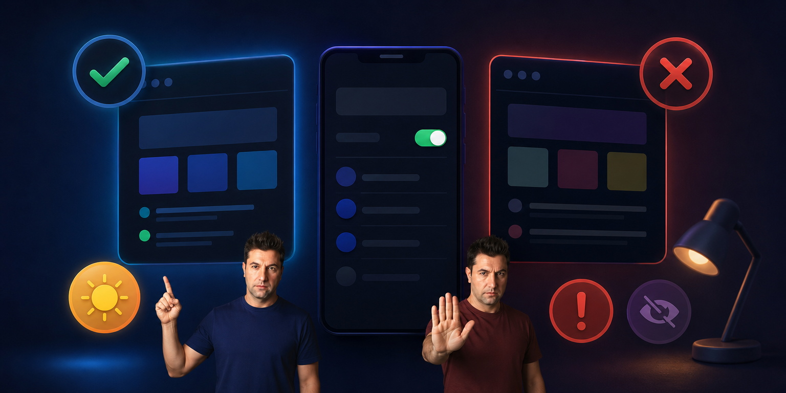
5 Critical Mistakes Commonly Made When Designing Dark Mode
5 Critical Mistakes Commonly Made When Designing Dark Mode
In recent years, dark mode has gone from being an aesthetic luxury to a standard in the digital world. It’s offered everywhere, from mobile apps to complex B2B SaaS panels, because it reduces eye strain, saves battery life, and improves focus.
However, designing a successful dark mode isn’t as simple as randomly inverting the colors of the existing light-colored interface. Dark mode design requires a completely different logic of contrast, accessibility, and light physics.
Here are 5 critical mistakes that interface designers frequently make when designing dark mode, and how to fix them:
1. Using Pure Black (#000000) Background
The most common mistake made by beginners in dark mode design is choosing pure black as the background color. White text and neon elements placed on a pure black background create a very high contrast on the screen, causing a “haloing effect”. This situation tires the user’s eyes more and makes reading text impossible, especially for people with astigmatism.
-
Correct Approach: Use dark gray tones (
#121212,#1E1E1Eor dark navy/blue undertone gray pixels) instead of pure black in the background. Dark gray also allows you to show the depth (elevation) of elements on the screen with shadows.
2. Ignoring Depth Perception (Elevation) and Shadows
In light-colored designs, we add a slight shadow (drop shadow) behind a card or menu to show that it is on top. However, shadows disappear in dark mode; because a black shadow is not visible on a dark background. Ignoring layer hierarchy and depth perception leads to the interface looking completely flat and suffocating.
-
Correct Approach: To show depth in dark mode, the proximity to light source logic is used. The closer an element is to the user (e.g., a pop-up or modal), the lighter the shade of gray it should be. Create a sense of depth by adding slightly transparent white opacities to the upper layers.
3. Carrying Vibrant and Saturated Colors Exactly as They Are in Light Mode
Corporate blues, bright purples, or vibrant reds that look great on a light theme literally “jump off the screen” and grate on the eyes when they switch to a dark background. Highly saturated colors appear to vibrate on dark backgrounds, significantly reducing readability.
-
The Right Approach: For dark mode, reduce the saturation (desaturate) of your color palette. Define more pastel, soft, and toned-down versions of your primary and secondary colors specifically for the dark mode palette (e.g., 20%-30% lighter pastel tones that comply with WCAG standards).
4. Forgetting Text Contrast and Accessibility (WCAG) Standards
The purpose of dark mode is to rest the eyes, but excessively reducing contrast and making text unreadable will have the opposite effect. Writing dark gray text on a dark gray background or using thin/light fonts violates accessibility standards.
-
Correct Approach: Always test the accessibility of your design. According to the WCAG (Web Content Accessibility Guidelines) standards, normal text should have a minimum contrast ratio of 4.5:1 between the background and the text. For large texts, this ratio should be at least 3:1. You can easily control these ratios with plugins (Contrast, etc.) in Figma.
5. Switch Images and Icons to Dark Mode
Product photos, logos, or graphics with a white background designed for light mode remain as bright white boxes on the screen when switching to dark mode. This disrupts visual integrity and suddenly bothers the user’s eyes.
Similarly, dark linear icons disappear against a dark background.
-
Correct Approach:
-
Make images transparent (PNG/SVG) by removing the white backgrounds behind them.
-
Slightly reduce the brightness of large photos or banners in dark mode using CSS filters (
filter: brightness(0.9)). -
Make sure the icon colors automatically turn white or pastel tones to contrast with the background.
-
Summary: Tips for a Perfect Dark Mode
Designing a successful dark mode isn’t just about painting the interface black. If you want to offer a minimalist and functional experience, you should use dark grays instead of pure black, reduce color saturation, convey layer hierarchy with light tones, and constantly monitor contrast ratios.
The secret to providing your users with a smooth and effortless digital experience, even late at night, lies in these small but critical details.